Note that your final mark will not be saved in the system.
Print Media Products (first teaching 2022) Notes
Page: Media Production Techniques – Print Media Products
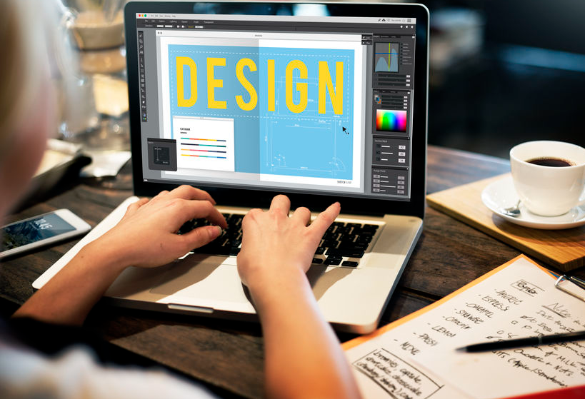
In this section, we will explore the various practical techniques that producers use to create print media products. By gaining an understanding of these various techniques, you will be able to confidently use print software and create your own products to a high standard.
Layout and Design
Whether you are producing a magazine cover or an A5 leaflet, you may find it useful to sketch out draft designs using pencils and paper. This will allow you to plan out and adjust the following key elements of layout and design:
- Alignment – this describes the way in which different elements are organised and displayed on the page. When creating a publishing product, many designers imagine the page is made up of evenly sized boxes that form an invisible grid. They ensure that the photos, text and graphics align with these grid boxes so the design becomes tidier and more symmetrical
- Balance – this describes the distribution of images and text to make sure all sections of a publishing product aren’t too cluttered or too sparse. If the balance of text to images, or vice versa, is unbalanced, the page may look as if it is tilting to one side.
- Contrast – this describes the way in which different elements of a publishing product are designed to visually complement or clash with one another. Contrast can also help you establish the most important elements of a product, e.g. the title on a film poster is unlikely to be the same size, colour and shape as the cast and crew. If they were the same, audiences would not be able to tell what the title was, and the poster would look dull.
- Proximity – this describes how close to one another different elements of a publishing product are. It is important that related design elements are positioned in close proximity to one another otherwise the product will become confusing to follow. On the other hand, if too many elements are confined to one area of the page, the product will look cluttered and unreadable.
- Repetition – when certain design elements are used more than once in order to create a particular effect. Colours, patterns and text structures are among the many elements that can be repeated. You should definitely consider repeating fonts – it is widely thought that a maximum of three different fonts should be used on a single page of text.
- White space – a term that refers to the empty space between text, images and graphics in a composition. White space is brilliant for ensuring that your content is easily readable, not too cramped and visually sophisticated. However, too much white space can make your design appear dull and lacking in information.
- Rule of odds – this suggests that publishing products possess more visual appeal when they feature an odd number of a certain element, e.g. three words, five bullet points – this does not necessarily apply to every design, but audiences generally find it more satisfying to be presented with groups of three or five. Groupings of two and four can sometimes make a page look unbalanced or unfocused.
Considering these factors early on will save you plenty of time when you come to eventually digitalise your products, i.e. produce them using a computer.
As well as images and the main body of text, there are other elements you are likely to include in a publishing media product:
| Caption | A word or phrase superimposed above or below an image, often saying who is talking, or where they are |
| Graphics | A visual element printed on publishing material |
| Underscoring | A line drawn under a word or phrase for emphasis |
Typography
Typography is essentially the style and appearance of fonts used in a publishing media product. In any form of publishing media, the style of font is crucially important in terms of creating meaning for audiences and capturing the style, genre and tone of a product.
A typeface is a family of fonts that share similar design attributes. Fonts are the specific designs that fall within the typeface families.
Different typefaces to consider
- Serif – serif typefaces have small lines and strokes extending from the ends of certain characters. They are used to establish a traditional, more formal tone. Font examples include Algerian, Baskerville, Times New Roman and Trajan.
- Sans-serif – sans-serif typefaces do not have lines and strokes extending from any of the characters. You can remember this by remembering that ‘sans’ means ‘without’. They often create a sense of simplicity and modernism. Font examples include Helvetica, Arial, Calibri and Myriad Pro.
- Script – script typefaces are designed to capture the fluid nature of handwriting. They tend to convey elegance and creativity. Font examples include Amaze, Angelina, Bella Donna and Freestyle Script.
- Display – display typefaces are designed for large headings and eccentric designs. They tend to be unique and very expressive. Font examples include Vanilla Twilight, Scooby Doo, Budmo Jiggler and Fabulous 50s.
Typography techniques to consider
- Size – how big or small the text is. Remember, when text is too small the characters begin to blend into one another, making it difficult for audiences to read. Text that is too large takes up a huge portion of a person’s vision. Therefore, it can break up the flow of text.
- Continuity – this ensures that the typography in a product is visually consistent – producers tend to use styles of font that all contribute to the same meaning. If you were to use a display font, a script font and a sans-serif font on a single page, the product would be tonally inconsistent.
- Letter spacing – this refers to the process of adjusting the space between characters in order to maintain consistent density within a whole body of text
- Line height – the distance between lines of text placed on top of one another. This determines how readable or cluttered text is, e.g. billing blocks on film posters are produced in a very small size. Therefore, they need an appropriate line height in order to ensure the text is readable.
- Readability – ensures that your choice of font isn’t too difficult for your audience to read. This sounds obvious, but so many amateur media producers try to be original with their typography for the sake of being original.
- Bold – this is used to make certain sections of text thicker and darker. This is used to emphasise certain words and signal their importance.
- Italics – commonly used in order to place emphasis on particular words or to make certain words stand out within a sentence. This is achieved by making the characters slant forwards, adding emotional emphasis.
- Underlining – used to place emphasis on certain words, clarify difficult or obscure words and (most commonly) to separate titles from main bodies of text
Photographic Techniques
- Composition – the arrangement of people, objects and their surrounding environment in a photograph, not unlike mise en scène. There are many rules and guidelines when it comes to photo composition. (See next page.)
- Image quality – sometimes referred to as resolution, this simply concerns how clear and detailed a photographic image is. The quality of a photograph can be improved by: sharpening the focus on the camera; selecting the appropriate shutter speed; finding appropriate lighting; post-production techniques, etc.
- Lighting effects – the ways in which a photograph is lit can have a huge effect on the meaning the photograph conveys. Different lighting techniques are appropriate for different scenarios – high-key lighting for magazine colours; black-and-white lighting for serious fundraising adverts
- Depth of field – this refers to how much of the photograph is in focus. A shallow depth of field is when only the subject in the foreground of the frame is in focus, as opposed to the background, which is blurred. This is often used to draw attention to a particular person or object within a busy frame. A deep depth of field is the opposite – the foreground and the background of the image are in focus.
- Aesthetic – refers to how beautiful or visually pleasing a photograph is to the viewer. Whereas composition is the techniques you use to take a photograph, the aesthetic refers to the result of your choices in composition.
Five additional tips and guidelines for photo composition
- If you want the audience to be focusing on a specific subject, allow that subject to fill the frame – if too much of the background is included, it will distract from the main subject
- Follow the rule of thirds – whenever you take a photograph, imagine that the frame is a grid made up of nine identical squares (like a noughts and crosses board). If you ensure that points of interest fit into the provided boxes, your photo is likely to be more balanced and visually pleasing.
- Images containing symmetry can be aesthetically pleasing to media audiences – not all great photos require an element of symmetry, but it can be an effective technique if you want to produce professional-looking photos
- Zooming in can spoil a photo – it is always better to shoot an image at close range rather than zooming in from a distance. This will prevent your photo from losing its quality.
- Shoot your main subject within a frame in order to draw focus to the subject – this frame could be an archway, tree branches or an area of light
Editing Techniques
- Filters – a function on a software application that can alter the appearance of an image. Filters can have an effect on colour, contrast, tone and texture. They can also be used to add special effects – think about face filter apps such as Snapchat and BeautyPlus.
- Colour and contrast – this refers to the difference between two states in a photograph – either tonal or colour. Increasing the tonal contrast of an image makes dark tones darker and light tones brighter. In terms of colour, certain pairs of colours are highly contrasting and will make each other appear brighter when placed next to one another, e.g. blue and orange, red and green.
- Layering images – layers are, quite simply, the different images, objects, graphics and text that make up an image file. Image editing software allows you to rearrange and edit individual components of a file without affecting others. For most applications, each ‘layer’ is listed in a panel on the side of the screen – the most common example of image layering is the imposing of an image or a graphic onto an existing image.
- Distorting images – an image editing technique that involves the clicking and dragging of an image to change its shape and proportions. Forms of distortion include the rotation, warping or skewing of an image.
- Scaling – a tool that enables an image or a shape to be resized. From a reference point, you can enlarge the object by dragging it outwards, or shrink it by dragging it inwards. While it is usually possible to enlarge an image safely, rescaling beyond a certain point will show a noticeable decrease in quality.
- Cropping – cropping an image involves cutting an image down to a specified section, excluding any unwanted sections of the image. Sometimes cropping involves trimming away a little detail around the edges, or you may isolate a small component of an image and discard everything else. Cropping an image does not change the resolution or image quality; it only shrinks the size of the canvas.
See below a list of software applications that may help you in the creation of a publishing media product:
- Microsoft Publisher – layout and design
- Microsoft Word – layout and design
- Adobe InDesign – layout and design
- Canva – layout and design
- Adobe Photoshop – image editing
- Luminar – image editing
Or click 'Enter' key!