Our site uses cookies. Some of the cookies we use are essential for parts of the site to operate and have already been set. You may delete and block all cookies from this site, but parts of the site will not work. To find out more about cookies on this website, see our Cookie Policy
Accept
© eRevision.uk and ZigZag Education 2025
This test is run by .
Note that your final mark will not be saved in the system.

Population GapFill

Running Total
0
0%
Attempt
1 of 3

You must fill all the gaps before clicking ‘Check Answers!’

image

Population Pyramids Explained 

 DemographicsGeologyVulcanologyMeteorologySeismologyOceanography 
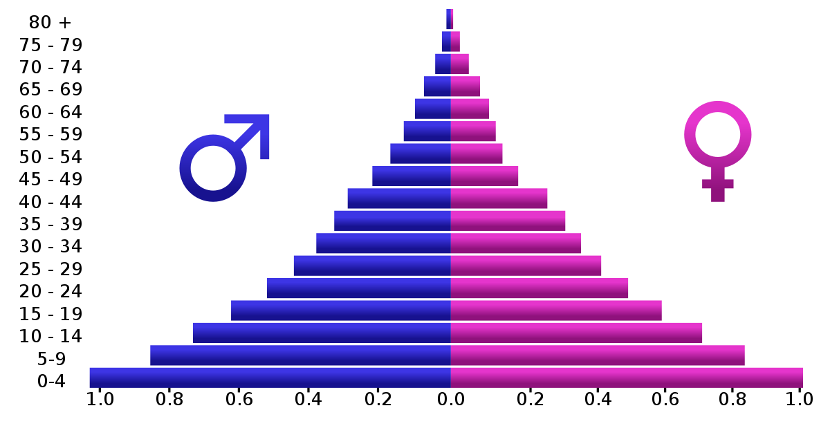
is the name given to the study of population. Every population has a different   shapevalueethnicitystructurestatusgender, meaning that it is made up of a unique combination of males and females of different ages. This is often represented in a population   censusmatrixpyramidspherestackdiamond many of which have recognisable shapes. A diagram with a very narrow top suggests a   high fertility ratelow life expectancyhigh life expectancylarge number of elderly peoplelow birth ratelarge number of females. A diagram with straight sides that looks rather like a pillar box suggests that the population is   contractingstableunstableageingyouthfulexpanding. Some diagrams are narrower at the top than at the bottom, which suggests that there are   fewermorethinnermore intelligentlighterbrighter babies born to each successive generation. If this is not addressed, it can lead to population   exterminationdecaycessationerosiondeclinecorruption and may also, in time, lead to a high   economicindependencedependencydemographicyouthfulgender ratio.This is when there are too few people who are   retiredeconomically activebabiesin old people's homespolice officersnurses to support those who are too old or frail to work.

This is your 1st attempt! You get 3 marks for each one you get right. Good luck!

Pass Mark
70%