Note that your final mark will not be saved in the system.
Publishing (last assessment 2023) GapFill
You must fill all the gaps before clicking ‘Check Answers!’
Harper’s Bazaar © Harper & Brothers, 2020
Fill in the gaps below to complete the analysis of how the front page of Harper's Bazaar magazine conveys meaning through the use of publishing media techniques:
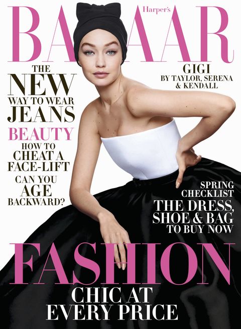
A great deal of effort has been made to ensure the of elements on the page is pleasing. As with most magazine covers, each key element slots neatly into an invisible grid, e.g. the cover star's face is central within the top middle square, the spring checklist cover line is central within the middle right square. By organising elements in this way, the creators have considered the .
The cover lines that offer tips on beauty and fashion are grouped together in one column; likewise, the items that can be bought are grouped together in a column - it is appropriate to have these similarly themed lines in close to one another. However, these lines are never too close to the extent that the page becomes cluttered - the creators have ensured there is plenty of between the sections of text and the cover star.
The creators have ensured there is tonal through the repetition of certain elements. All written text has been produced using a typeface, establishing and sophisticated tone. An attempt has also been made to make the text clear and tidy through appropriate – there is a risk that this typeface makes it hard to differentiate characters, but gaps have been left between the characters to ensure good .
The of the photograph successfully draws attention to the cover star – she occupies the majority of the frame with her large dress, and her head, which takes up less space, is placed front and centre of the frame, ensuring she is the main point of attention. As with with most magazine covers, lighting has been used to establish a light-hearted tone and to ensure the model's clothes and make-up are fully visible. There is good , however, because of the effective balance between the model's black-and-white clothing.