This test is run by .
Note that your final mark will not be saved in the system.
Note that your final mark will not be saved in the system.
Marketing: Kiss of the Vampire (Print) GapFill
Target Level
C
Running Total
0
0%
Attempt
1 of 3
You must fill all the gaps before clicking ‘Check Answers!’
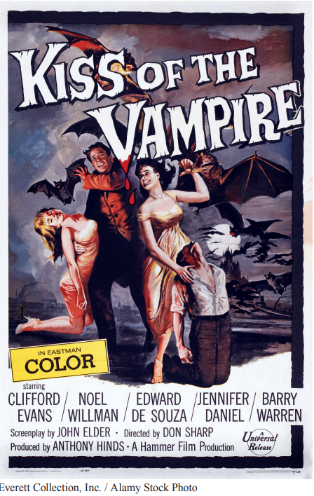
The poster for Kiss of the Vampire is stylistically typical of the horror film posters released at the time. The imagery is presented through painted illustration as opposed to the
that is often used today. The nature of the layout places the title in the top third of the poster while all additional information is confined to the bottom third of the page. The written codes and conventions are typical here, ranging from the director and screenwriter to the producers and
(distinctively arranged so the better-paid, higher-valued male actors' names are read first). The Popular production company is displayed in written text as is the official
for the company that produced and distributed the film. The
of the title is fairly traditional but it is also stylised in a way that specifically fits the genre. The
font is textured in a way that makes the text look wooden, connoting the wooden stakes that are famously used to kill vampires in horror films. Furthermore, the stylish use of the ‘V’ as a bloody fang offers
to the text by implying that the titular vampire is violent and dangerous. The poster features
which immediately signifies the horror genre: violent sexualised imagery, the full moon looking over the Gothic-inspired castle, deadly bats, victims with exposed necks, etc. Furthermore, the colour palette makes use of reds, blacks and browns, invoking an atmosphere of violence, passion and death.
The image of two victims kneeling submissively at the feet of their attackers arguably acts as code since their fate is left a mystery. Audiences need to watch the film in order to find out whether they survive. More so than contemporary film posters, the set product is full of codes ranging from the swarming bats attacking the characters to the vampires seemingly about to attack the kneeling victims. One could also decipher numerous codes from the poster due to the high number of binary opposites: good vs evil, victim vs perpetrator, monster vs human, kissing vs biting, etc. The abundance of such opposites allows for the poster to be understood using the theory of by Claude Lévi-Strauss.
The representation of women on the poster is a significant point of study. The blonde character is shown to be a passive victim on the verge of fainting. Her neck is arched back, emphasising her figure in a highly sexualised manner. On the contrary, the brunette is shown to be aggressive and physically domineering, seemingly adopting the role of the film’s . Most unusually, the gesture code of the male vampire suggests that he is cowering, making the brunette emerge as the film’s most dangerous character. This could reflect an attempt on the part of film producers to give women more complex and exciting roles. However, it could also be read as a patriarchal warning against as it implies that domineering women can be dangerous. In support of this argument, the dress codes of both women present as sexualised, traditionally effeminate women since the dresses expose flesh on their arms, legs and upper body. The feminist theory of can be applied to the poster as the women’s bodies are presented as . It is likely that the poster was designed to appeal to a heterosexual male audience correlating to the social norms and attitudes towards women during the 1960s.